> ## Documentation Index
> Fetch the complete documentation index at: https://v5.rpgjs.dev/llms.txt
> Use this file to discover all available pages before exploring further.
# Components
> Component-based UI layout helpers and component utilities for players.
# Components
Component-based UI layout helpers and component utilities for players.
Server-driven components are authoritative descriptions of sprite UI. Built-in
helpers such as `Components.text()` and `Components.hpBar()` use RPGJS renderers,
while `Components.custom(id, props)` targets a CanvasEngine component registered
on the client under `sprite.components`.
## Usage Guide
The server decides which components are displayed and sends a serializable
description to every client on the map. The client renders the component and
updates dynamic values such as `{name}`, `{hp}` or `{param.maxHp}` when
synchronized player properties change.
### Display Name Above The Player
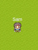 In your server player file:
```ts theme={null}
import { RpgPlayer, type RpgPlayerHooks, Components } from '@rpgjs/server'
const player: RpgPlayerHooks = {
onConnected(player: RpgPlayer) {
player.setHitbox(16, 16)
player.setGraphic('hero')
player.name = 'Sam'
player.setComponentsTop(Components.text('{name}'))
}
}
export default player
```
`Components.text('{name}')` creates a text component. The `{name}` placeholder
is resolved on the client from the synchronized player property.
Prefer placeholders instead of injecting the current value yourself:
```ts theme={null}
player.setComponentsTop(Components.text(player.name))
```
With `{name}`, changing the player name only synchronizes the `name` property.
With `player.name`, the server must send a new component structure every time.
### Text Style
In your server player file:
```ts theme={null}
import { RpgPlayer, type RpgPlayerHooks, Components } from '@rpgjs/server'
const player: RpgPlayerHooks = {
onConnected(player: RpgPlayer) {
player.setHitbox(16, 16)
player.setGraphic('hero')
player.name = 'Sam'
player.setComponentsTop(Components.text('{name}'))
}
}
export default player
```
`Components.text('{name}')` creates a text component. The `{name}` placeholder
is resolved on the client from the synchronized player property.
Prefer placeholders instead of injecting the current value yourself:
```ts theme={null}
player.setComponentsTop(Components.text(player.name))
```
With `{name}`, changing the player name only synchronizes the `name` property.
With `player.name`, the server must send a new component structure every time.
### Text Style
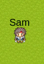 ```ts theme={null}
player.setComponentsTop(Components.text('{name}', {
fill: '#000000',
fontSize: 20
}))
```
Text style supports common CanvasEngine text options such as `fill`,
`fontSize`, `fontFamily`, `fontStyle`, `fontWeight`, `stroke`, `opacity`,
`wordWrap` and `align`.
### Multiple Lines And Columns
```ts theme={null}
player.setComponentsTop(Components.text('{name}', {
fill: '#000000',
fontSize: 20
}))
```
Text style supports common CanvasEngine text options such as `fill`,
`fontSize`, `fontFamily`, `fontStyle`, `fontWeight`, `stroke`, `opacity`,
`wordWrap` and `align`.
### Multiple Lines And Columns
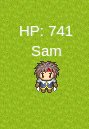 A one-dimensional array is rendered vertically:
```ts theme={null}
player.setComponentsTop([
Components.text('HP: {hp}'),
Components.text('{name}')
])
```
A two-dimensional array is rendered as rows and columns:
```ts theme={null}
player.setComponentsTop([
[Components.text('{hp}'), Components.text('{name}')]
])
```
### Layout Options
```ts theme={null}
player.setComponentsTop([
Components.text('HP: {hp}'),
Components.text('{name}')
], {
width: 100,
height: 30,
marginBottom: 8
})
```
Layout options configure the block that contains the components:
* `width` and `height` define the layout box.
* `marginBottom` moves a `top` or `bottom` component away from the sprite.
* `marginRight` moves a `left` component away from the sprite.
* `marginLeft` moves a `right` component away from the sprite.
* `marginTop` can be used for additional vertical adjustment.
`top`, `left` and `right` are placed outside the sprite graphic bounds, so they
do not cover a graphic that is larger than the hitbox. `top` is centered on the
graphic. `bottom` uses the hitbox as its positioning rectangle; a `32x32` shape
inside a `32x32` hitbox matches the hitbox when centered.
### HP And SP Bars
A one-dimensional array is rendered vertically:
```ts theme={null}
player.setComponentsTop([
Components.text('HP: {hp}'),
Components.text('{name}')
])
```
A two-dimensional array is rendered as rows and columns:
```ts theme={null}
player.setComponentsTop([
[Components.text('{hp}'), Components.text('{name}')]
])
```
### Layout Options
```ts theme={null}
player.setComponentsTop([
Components.text('HP: {hp}'),
Components.text('{name}')
], {
width: 100,
height: 30,
marginBottom: 8
})
```
Layout options configure the block that contains the components:
* `width` and `height` define the layout box.
* `marginBottom` moves a `top` or `bottom` component away from the sprite.
* `marginRight` moves a `left` component away from the sprite.
* `marginLeft` moves a `right` component away from the sprite.
* `marginTop` can be used for additional vertical adjustment.
`top`, `left` and `right` are placed outside the sprite graphic bounds, so they
do not cover a graphic that is larger than the hitbox. `top` is centered on the
graphic. `bottom` uses the hitbox as its positioning rectangle; a `32x32` shape
inside a `32x32` hitbox matches the hitbox when centered.
### HP And SP Bars
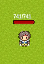 ```ts theme={null}
player.setComponentsTop(Components.hpBar(), {
width: 42
})
```
`Components.hpBar()` reads `hp` and `param.maxHp` and uses a red fill by
default. `Components.spBar()` reads `sp` and `param.maxSp` and uses a blue fill
by default. Pass `fillColor` to override the default color.
```ts theme={null}
player.setComponentsTop(Components.spBar({
width: 42,
fillColor: '#60a5fa'
}))
```
#### Bar Text
```ts theme={null}
player.setComponentsTop(Components.hpBar(), {
width: 42
})
```
`Components.hpBar()` reads `hp` and `param.maxHp` and uses a red fill by
default. `Components.spBar()` reads `sp` and `param.maxSp` and uses a blue fill
by default. Pass `fillColor` to override the default color.
```ts theme={null}
player.setComponentsTop(Components.spBar({
width: 42,
fillColor: '#60a5fa'
}))
```
#### Bar Text
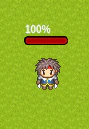 ```ts theme={null}
player.setComponentsTop(
Components.hpBar({}, '{$percent}%'),
{ width: 42 }
)
```
The text is displayed above the bar and aligned to the left edge of the bar. It
does not move when the current value changes.
Bar text can use normal player placeholders and bar-specific placeholders:
* `{$current}`: current value
* `{$max}`: maximum value
* `{$percent}`: percentage without the `%` sign
Set the text to `null` to hide it:
```ts theme={null}
player.setComponentsTop(Components.hpBar({}, null))
```
### Other Positions
```ts theme={null}
player.setComponentsTop(
Components.hpBar({}, '{$percent}%'),
{ width: 42 }
)
```
The text is displayed above the bar and aligned to the left edge of the bar. It
does not move when the current value changes.
Bar text can use normal player placeholders and bar-specific placeholders:
* `{$current}`: current value
* `{$max}`: maximum value
* `{$percent}`: percentage without the `%` sign
Set the text to `null` to hide it:
```ts theme={null}
player.setComponentsTop(Components.hpBar({}, null))
```
### Other Positions
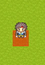 ```ts theme={null}
player.setComponentsBottom(
Components.shape({
type: 'rect',
width: 32,
height: 32,
fill: '#ff0000',
opacity: 0.5
}),
{
marginBottom: 16
}
)
```
Available positions are:
```ts theme={null}
player.setComponentsTop(Components.text('{name}'))
player.setComponentsBottom(Components.hpBar())
player.setComponentsLeft(Components.text('L'))
player.setComponentsRight(Components.text('R'))
player.setComponentsCenter(Components.shape({
type: 'circle',
radius: 8,
fill: '#ffffff'
}))
```
Use `player.removeComponents(position)` to remove all components at a position:
```ts theme={null}
player.removeComponents('top')
```
### Custom Player Properties
Any synchronized player property can be used in placeholders.
```ts theme={null}
import { RpgPlayer, type RpgPlayerHooks, Components } from '@rpgjs/server'
declare module '@rpgjs/server' {
export interface RpgPlayer {
wood: number
}
}
const player: RpgPlayerHooks = {
props: {
wood: Number
},
onConnected(player: RpgPlayer) {
player.wood = 0
player.setComponentsTop(Components.text('Wood: {wood}'))
}
}
export default player
```
You can also create a bar for a custom value:
```ts theme={null}
player.addParameter('maxWood', {
start: 100,
end: 500
})
player.wood = player.param.maxWood
player.setComponentsTop(
Components.bar('wood', 'param.maxWood', {}, 'Wood: {$current}/{$max}')
)
```
### Custom CanvasEngine Components
Register a reusable CanvasEngine component on the client:
```ts theme={null}
// client.ts
import { defineModule, RpgClient } from '@rpgjs/client'
import GuildBadge from './components/guild-badge.ce'
export default defineModule({
sprite: {
components: {
guildBadge: GuildBadge
}
}
})
```
Create the component:
```html theme={null}
```
Then let the server decide when to display it:
```ts theme={null}
player.setComponentsTop([
Components.custom('guildBadge', {
guildName: '{guild.name}',
color: '{guild.color}'
})
])
```
Custom props must be serializable: strings, numbers, booleans, arrays and plain
objects. They can contain placeholders, so the component receives updated values
when synchronized player properties change.
### Graphic IDs And Legacy Tile IDs
`player.setGraphic()` accepts a spritesheet id, a legacy tile id, or an array
mixing both:
```ts theme={null}
player.setGraphic('hero')
player.setGraphic(3)
player.setGraphic(['body', 'shield', 3])
```
Numeric graphics are kept for compatibility with tile-based projects. Projects
without a tile graphic resolver can ignore numeric ids and use spritesheet ids.
### Components Or Animations
Use server-driven sprite components for persistent UI controlled by the server:
name tags, HP bars, guild badges and status icons.
Use `componentAnimations` and `showComponentAnimation()` for temporary effects:
hit numbers, explosions, spell effects and transitions that remove themselves
with `onFinish`.
## Members
* [mergeComponents](#mergecomponents)
* [mergeComponents](#mergecomponents)
* [removeComponents](#removecomponents)
* [removeComponents](#removecomponents)
* [setComponentsBottom](#setcomponentsbottom)
* [setComponentsBottom](#setcomponentsbottom)
* [setComponentsCenter](#setcomponentscenter)
* [setComponentsCenter](#setcomponentscenter)
* [setComponentsLeft](#setcomponentsleft)
* [setComponentsLeft](#setcomponentsleft)
* [setComponentsRight](#setcomponentsright)
* [setComponentsRight](#setcomponentsright)
* [setComponentsTop](#setcomponentstop)
* [setComponentsTop](#setcomponentstop)
* [setGraphic](#setgraphic)
* [WithComponentManager](#withcomponentmanager)
## mergeComponents
Merge components with existing components at a specific position
Merges new components with existing components at the specified position.
* Source: `packages/server/src/Player/ComponentManager.ts`
* Kind: `method`
### Signature
```ts theme={null}
mergeComponents(position: ComponentPosition, layout: ComponentInput, options?: ComponentLayout): void
```
### Parameters
* `position`: `ComponentPosition`
* `layout`: `ComponentInput`
* `options?`: `ComponentLayout`
### Returns
void
### Examples
```ts theme={null}
// First set some components
player.setComponentsTop([Components.text('{name}')]);
// Then merge additional components
player.mergeComponents('top', [Components.hpBar()], {
width: 100
});
```
## mergeComponents
Merge components with existing components at a specific position
* Source: `packages/server/src/Player/ComponentManager.ts`
* Kind: `method`
* Defined in: `IComponentManager`
### Signature
```ts theme={null}
mergeComponents(position: ComponentPosition, layout: ComponentInput, options?: ComponentLayout): void
```
### Parameters
* `position`: `ComponentPosition`
* `layout`: `ComponentInput`
* `options?`: `ComponentLayout`
### Returns
void
## removeComponents
Remove components from a specific position
Deletes all components at the specified position.
* Source: `packages/server/src/Player/ComponentManager.ts`
* Kind: `method`
### Signature
```ts theme={null}
removeComponents(position: ComponentPosition): void
```
### Parameters
* `position`: `ComponentPosition`
### Returns
void
### Examples
```ts theme={null}
player.removeComponents('top');
```
## removeComponents
Remove components from a specific position
* Source: `packages/server/src/Player/ComponentManager.ts`
* Kind: `method`
* Defined in: `IComponentManager`
### Signature
```ts theme={null}
removeComponents(position: ComponentPosition): void
```
### Parameters
* `position`: `ComponentPosition`
### Returns
void
## setComponentsBottom
Set components to display below the player graphic
Components are displayed below the player's sprite and can include
text, bars, shapes, or any combination. The components are synchronized
to all clients on the map.
* Source: `packages/server/src/Player/ComponentManager.ts`
* Kind: `method`
### Signature
```ts theme={null}
setComponentsBottom(layout: ComponentInput, options?: ComponentLayout): void
```
### Parameters
* `layout`: `ComponentInput`
* `options?`: `ComponentLayout`
### Returns
void
### Examples
```ts theme={null}
player.setComponentsBottom(Components.shape({
fill: '#ff0000',
type: 'rectangle',
width: 32,
height: 32
}), {
marginBottom: 16
});
```
## setComponentsBottom
Set components to display below the player graphic
* Source: `packages/server/src/Player/ComponentManager.ts`
* Kind: `method`
* Defined in: `IComponentManager`
### Signature
```ts theme={null}
setComponentsBottom(layout: ComponentInput, options?: ComponentLayout): void
```
### Parameters
* `layout`: `ComponentInput`
* `options?`: `ComponentLayout`
### Returns
void
## setComponentsCenter
Set components to display at the center of the player graphic
Components are displayed at the center of the player's sprite.
Be careful: if you assign, it deletes the graphics and if the lines are superimposed.
* Source: `packages/server/src/Player/ComponentManager.ts`
* Kind: `method`
### Signature
```ts theme={null}
setComponentsCenter(layout: ComponentInput, options?: ComponentLayout): void
```
### Parameters
* `layout`: `ComponentInput`
* `options?`: `ComponentLayout`
### Returns
void
### Examples
```ts theme={null}
player.setComponentsCenter([
Components.text('{name}'),
Components.hpBar()
]);
```
## setComponentsCenter
Set components to display at the center of the player graphic
* Source: `packages/server/src/Player/ComponentManager.ts`
* Kind: `method`
* Defined in: `IComponentManager`
### Signature
```ts theme={null}
setComponentsCenter(layout: ComponentInput, options?: ComponentLayout): void
```
### Parameters
* `layout`: `ComponentInput`
* `options?`: `ComponentLayout`
### Returns
void
## setComponentsLeft
Set components to display to the left of the player graphic
Components are displayed to the left of the player's sprite.
* Source: `packages/server/src/Player/ComponentManager.ts`
* Kind: `method`
### Signature
```ts theme={null}
setComponentsLeft(layout: ComponentInput, options?: ComponentLayout): void
```
### Parameters
* `layout`: `ComponentInput`
* `options?`: `ComponentLayout`
### Returns
void
### Examples
```ts theme={null}
player.setComponentsLeft([
Components.text('{name}'),
Components.hpBar()
]);
```
## setComponentsLeft
Set components to display to the left of the player graphic
* Source: `packages/server/src/Player/ComponentManager.ts`
* Kind: `method`
* Defined in: `IComponentManager`
### Signature
```ts theme={null}
setComponentsLeft(layout: ComponentInput, options?: ComponentLayout): void
```
### Parameters
* `layout`: `ComponentInput`
* `options?`: `ComponentLayout`
### Returns
void
## setComponentsRight
Set components to display to the right of the player graphic
Components are displayed to the right of the player's sprite.
* Source: `packages/server/src/Player/ComponentManager.ts`
* Kind: `method`
### Signature
```ts theme={null}
setComponentsRight(layout: ComponentInput, options?: ComponentLayout): void
```
### Parameters
* `layout`: `ComponentInput`
* `options?`: `ComponentLayout`
### Returns
void
### Examples
```ts theme={null}
player.setComponentsRight([
Components.text('{name}'),
Components.hpBar()
]);
```
## setComponentsRight
Set components to display to the right of the player graphic
* Source: `packages/server/src/Player/ComponentManager.ts`
* Kind: `method`
* Defined in: `IComponentManager`
### Signature
```ts theme={null}
setComponentsRight(layout: ComponentInput, options?: ComponentLayout): void
```
### Parameters
* `layout`: `ComponentInput`
* `options?`: `ComponentLayout`
### Returns
void
## setComponentsTop
Set components to display above the player graphic
Components are displayed above the player's sprite and can include
text, bars, shapes, or any combination. The components are synchronized
to all clients on the map.
* Source: `packages/server/src/Player/ComponentManager.ts`
* Kind: `method`
### Signature
```ts theme={null}
setComponentsTop(layout: ComponentInput, options?: ComponentLayout): void
```
### Parameters
* `layout`: `ComponentInput`
* `options?`: `ComponentLayout`
### Returns
void
### Examples
```ts theme={null}
// Single text component
player.setComponentsTop(Components.text('{name}'));
// Multiple components vertically
player.setComponentsTop([
Components.text('HP: {hp}'),
Components.text('{name}')
]);
// Table layout (columns)
player.setComponentsTop([
[Components.text('{hp}'), Components.text('{name}')]
]);
// With layout options
player.setComponentsTop([
Components.text('HP: {hp}'),
Components.text('{name}')
], {
width: 100,
height: 30,
marginBottom: 8
});
```
## setComponentsTop
Set components to display above the player graphic
* Source: `packages/server/src/Player/ComponentManager.ts`
* Kind: `method`
* Defined in: `IComponentManager`
### Signature
```ts theme={null}
setComponentsTop(layout: ComponentInput, options?: ComponentLayout): void
```
### Parameters
* `layout`: `ComponentInput`
* `options?`: `ComponentLayout`
### Returns
void
## setGraphic
Set the graphic(s) for this player
Allows setting either a single graphic or multiple graphics for the player.
When multiple graphics are provided, they are used for animation sequences.
The graphics system provides flexible visual representation that can be
dynamically changed during gameplay for different states, equipment, or animations.
* Source: `packages/server/src/Player/ComponentManager.ts`
* Kind: `method`
* Defined in: `IComponentManager`
### Signature
```ts theme={null}
setGraphic(graphic: string | number | (string | number)[]): void
```
### Parameters
* `graphic`: `string | number | (string | number)[]`
### Returns
void
### Examples
```ts theme={null}
// Set a single graphic for static representation
player.setGraphic("hero");
// Set multiple graphics for animation sequences
player.setGraphic(["hero_idle", "hero_walk", "hero_run"]);
// Set a legacy tile id
player.setGraphic(3);
// Mix sprite ids and legacy tile ids
player.setGraphic(["hero_idle", 4, "hero_run"]);
// Dynamic graphic changes based on equipment
if (player.hasArmor('platemail')) {
player.setGraphic("hero_armored");
}
// Animation sequences for different actions
player.setGraphic(["mage_cast_1", "mage_cast_2", "mage_cast_3"]);
```
## WithComponentManager
Component Manager Mixin
Provides graphic and component management capabilities to any class. This mixin allows
setting single or multiple graphics for player representation, enabling
dynamic visual changes and animation sequences. It also provides methods to
display UI components around the player graphic (top, bottom, center, left, right).
Components are stored as JSON strings for efficient synchronization.
* Source: `packages/server/src/Player/ComponentManager.ts`
* Kind: `function`
### Signature
```ts theme={null}
WithComponentManager(Base: TBase): new (...args: ConstructorParameters) => InstanceType & IComponentManager
```
### Parameters
* `Base`: `TBase`
### Returns
Extended class with component management methods
### Examples
```ts theme={null}
class MyPlayer extends WithComponentManager(BasePlayer) {
constructor() {
super();
this.setGraphic("hero");
}
}
const player = new MyPlayer();
player.setGraphic(["hero_idle", "hero_walk"]);
player.setComponentsTop(Components.text('{name}'));
```
```ts theme={null}
player.setComponentsBottom(
Components.shape({
type: 'rect',
width: 32,
height: 32,
fill: '#ff0000',
opacity: 0.5
}),
{
marginBottom: 16
}
)
```
Available positions are:
```ts theme={null}
player.setComponentsTop(Components.text('{name}'))
player.setComponentsBottom(Components.hpBar())
player.setComponentsLeft(Components.text('L'))
player.setComponentsRight(Components.text('R'))
player.setComponentsCenter(Components.shape({
type: 'circle',
radius: 8,
fill: '#ffffff'
}))
```
Use `player.removeComponents(position)` to remove all components at a position:
```ts theme={null}
player.removeComponents('top')
```
### Custom Player Properties
Any synchronized player property can be used in placeholders.
```ts theme={null}
import { RpgPlayer, type RpgPlayerHooks, Components } from '@rpgjs/server'
declare module '@rpgjs/server' {
export interface RpgPlayer {
wood: number
}
}
const player: RpgPlayerHooks = {
props: {
wood: Number
},
onConnected(player: RpgPlayer) {
player.wood = 0
player.setComponentsTop(Components.text('Wood: {wood}'))
}
}
export default player
```
You can also create a bar for a custom value:
```ts theme={null}
player.addParameter('maxWood', {
start: 100,
end: 500
})
player.wood = player.param.maxWood
player.setComponentsTop(
Components.bar('wood', 'param.maxWood', {}, 'Wood: {$current}/{$max}')
)
```
### Custom CanvasEngine Components
Register a reusable CanvasEngine component on the client:
```ts theme={null}
// client.ts
import { defineModule, RpgClient } from '@rpgjs/client'
import GuildBadge from './components/guild-badge.ce'
export default defineModule({
sprite: {
components: {
guildBadge: GuildBadge
}
}
})
```
Create the component:
```html theme={null}
```
Then let the server decide when to display it:
```ts theme={null}
player.setComponentsTop([
Components.custom('guildBadge', {
guildName: '{guild.name}',
color: '{guild.color}'
})
])
```
Custom props must be serializable: strings, numbers, booleans, arrays and plain
objects. They can contain placeholders, so the component receives updated values
when synchronized player properties change.
### Graphic IDs And Legacy Tile IDs
`player.setGraphic()` accepts a spritesheet id, a legacy tile id, or an array
mixing both:
```ts theme={null}
player.setGraphic('hero')
player.setGraphic(3)
player.setGraphic(['body', 'shield', 3])
```
Numeric graphics are kept for compatibility with tile-based projects. Projects
without a tile graphic resolver can ignore numeric ids and use spritesheet ids.
### Components Or Animations
Use server-driven sprite components for persistent UI controlled by the server:
name tags, HP bars, guild badges and status icons.
Use `componentAnimations` and `showComponentAnimation()` for temporary effects:
hit numbers, explosions, spell effects and transitions that remove themselves
with `onFinish`.
## Members
* [mergeComponents](#mergecomponents)
* [mergeComponents](#mergecomponents)
* [removeComponents](#removecomponents)
* [removeComponents](#removecomponents)
* [setComponentsBottom](#setcomponentsbottom)
* [setComponentsBottom](#setcomponentsbottom)
* [setComponentsCenter](#setcomponentscenter)
* [setComponentsCenter](#setcomponentscenter)
* [setComponentsLeft](#setcomponentsleft)
* [setComponentsLeft](#setcomponentsleft)
* [setComponentsRight](#setcomponentsright)
* [setComponentsRight](#setcomponentsright)
* [setComponentsTop](#setcomponentstop)
* [setComponentsTop](#setcomponentstop)
* [setGraphic](#setgraphic)
* [WithComponentManager](#withcomponentmanager)
## mergeComponents
Merge components with existing components at a specific position
Merges new components with existing components at the specified position.
* Source: `packages/server/src/Player/ComponentManager.ts`
* Kind: `method`
### Signature
```ts theme={null}
mergeComponents(position: ComponentPosition, layout: ComponentInput, options?: ComponentLayout): void
```
### Parameters
* `position`: `ComponentPosition`
* `layout`: `ComponentInput`
* `options?`: `ComponentLayout`
### Returns
void
### Examples
```ts theme={null}
// First set some components
player.setComponentsTop([Components.text('{name}')]);
// Then merge additional components
player.mergeComponents('top', [Components.hpBar()], {
width: 100
});
```
## mergeComponents
Merge components with existing components at a specific position
* Source: `packages/server/src/Player/ComponentManager.ts`
* Kind: `method`
* Defined in: `IComponentManager`
### Signature
```ts theme={null}
mergeComponents(position: ComponentPosition, layout: ComponentInput, options?: ComponentLayout): void
```
### Parameters
* `position`: `ComponentPosition`
* `layout`: `ComponentInput`
* `options?`: `ComponentLayout`
### Returns
void
## removeComponents
Remove components from a specific position
Deletes all components at the specified position.
* Source: `packages/server/src/Player/ComponentManager.ts`
* Kind: `method`
### Signature
```ts theme={null}
removeComponents(position: ComponentPosition): void
```
### Parameters
* `position`: `ComponentPosition`
### Returns
void
### Examples
```ts theme={null}
player.removeComponents('top');
```
## removeComponents
Remove components from a specific position
* Source: `packages/server/src/Player/ComponentManager.ts`
* Kind: `method`
* Defined in: `IComponentManager`
### Signature
```ts theme={null}
removeComponents(position: ComponentPosition): void
```
### Parameters
* `position`: `ComponentPosition`
### Returns
void
## setComponentsBottom
Set components to display below the player graphic
Components are displayed below the player's sprite and can include
text, bars, shapes, or any combination. The components are synchronized
to all clients on the map.
* Source: `packages/server/src/Player/ComponentManager.ts`
* Kind: `method`
### Signature
```ts theme={null}
setComponentsBottom(layout: ComponentInput, options?: ComponentLayout): void
```
### Parameters
* `layout`: `ComponentInput`
* `options?`: `ComponentLayout`
### Returns
void
### Examples
```ts theme={null}
player.setComponentsBottom(Components.shape({
fill: '#ff0000',
type: 'rectangle',
width: 32,
height: 32
}), {
marginBottom: 16
});
```
## setComponentsBottom
Set components to display below the player graphic
* Source: `packages/server/src/Player/ComponentManager.ts`
* Kind: `method`
* Defined in: `IComponentManager`
### Signature
```ts theme={null}
setComponentsBottom(layout: ComponentInput, options?: ComponentLayout): void
```
### Parameters
* `layout`: `ComponentInput`
* `options?`: `ComponentLayout`
### Returns
void
## setComponentsCenter
Set components to display at the center of the player graphic
Components are displayed at the center of the player's sprite.
Be careful: if you assign, it deletes the graphics and if the lines are superimposed.
* Source: `packages/server/src/Player/ComponentManager.ts`
* Kind: `method`
### Signature
```ts theme={null}
setComponentsCenter(layout: ComponentInput, options?: ComponentLayout): void
```
### Parameters
* `layout`: `ComponentInput`
* `options?`: `ComponentLayout`
### Returns
void
### Examples
```ts theme={null}
player.setComponentsCenter([
Components.text('{name}'),
Components.hpBar()
]);
```
## setComponentsCenter
Set components to display at the center of the player graphic
* Source: `packages/server/src/Player/ComponentManager.ts`
* Kind: `method`
* Defined in: `IComponentManager`
### Signature
```ts theme={null}
setComponentsCenter(layout: ComponentInput, options?: ComponentLayout): void
```
### Parameters
* `layout`: `ComponentInput`
* `options?`: `ComponentLayout`
### Returns
void
## setComponentsLeft
Set components to display to the left of the player graphic
Components are displayed to the left of the player's sprite.
* Source: `packages/server/src/Player/ComponentManager.ts`
* Kind: `method`
### Signature
```ts theme={null}
setComponentsLeft(layout: ComponentInput, options?: ComponentLayout): void
```
### Parameters
* `layout`: `ComponentInput`
* `options?`: `ComponentLayout`
### Returns
void
### Examples
```ts theme={null}
player.setComponentsLeft([
Components.text('{name}'),
Components.hpBar()
]);
```
## setComponentsLeft
Set components to display to the left of the player graphic
* Source: `packages/server/src/Player/ComponentManager.ts`
* Kind: `method`
* Defined in: `IComponentManager`
### Signature
```ts theme={null}
setComponentsLeft(layout: ComponentInput, options?: ComponentLayout): void
```
### Parameters
* `layout`: `ComponentInput`
* `options?`: `ComponentLayout`
### Returns
void
## setComponentsRight
Set components to display to the right of the player graphic
Components are displayed to the right of the player's sprite.
* Source: `packages/server/src/Player/ComponentManager.ts`
* Kind: `method`
### Signature
```ts theme={null}
setComponentsRight(layout: ComponentInput, options?: ComponentLayout): void
```
### Parameters
* `layout`: `ComponentInput`
* `options?`: `ComponentLayout`
### Returns
void
### Examples
```ts theme={null}
player.setComponentsRight([
Components.text('{name}'),
Components.hpBar()
]);
```
## setComponentsRight
Set components to display to the right of the player graphic
* Source: `packages/server/src/Player/ComponentManager.ts`
* Kind: `method`
* Defined in: `IComponentManager`
### Signature
```ts theme={null}
setComponentsRight(layout: ComponentInput, options?: ComponentLayout): void
```
### Parameters
* `layout`: `ComponentInput`
* `options?`: `ComponentLayout`
### Returns
void
## setComponentsTop
Set components to display above the player graphic
Components are displayed above the player's sprite and can include
text, bars, shapes, or any combination. The components are synchronized
to all clients on the map.
* Source: `packages/server/src/Player/ComponentManager.ts`
* Kind: `method`
### Signature
```ts theme={null}
setComponentsTop(layout: ComponentInput, options?: ComponentLayout): void
```
### Parameters
* `layout`: `ComponentInput`
* `options?`: `ComponentLayout`
### Returns
void
### Examples
```ts theme={null}
// Single text component
player.setComponentsTop(Components.text('{name}'));
// Multiple components vertically
player.setComponentsTop([
Components.text('HP: {hp}'),
Components.text('{name}')
]);
// Table layout (columns)
player.setComponentsTop([
[Components.text('{hp}'), Components.text('{name}')]
]);
// With layout options
player.setComponentsTop([
Components.text('HP: {hp}'),
Components.text('{name}')
], {
width: 100,
height: 30,
marginBottom: 8
});
```
## setComponentsTop
Set components to display above the player graphic
* Source: `packages/server/src/Player/ComponentManager.ts`
* Kind: `method`
* Defined in: `IComponentManager`
### Signature
```ts theme={null}
setComponentsTop(layout: ComponentInput, options?: ComponentLayout): void
```
### Parameters
* `layout`: `ComponentInput`
* `options?`: `ComponentLayout`
### Returns
void
## setGraphic
Set the graphic(s) for this player
Allows setting either a single graphic or multiple graphics for the player.
When multiple graphics are provided, they are used for animation sequences.
The graphics system provides flexible visual representation that can be
dynamically changed during gameplay for different states, equipment, or animations.
* Source: `packages/server/src/Player/ComponentManager.ts`
* Kind: `method`
* Defined in: `IComponentManager`
### Signature
```ts theme={null}
setGraphic(graphic: string | number | (string | number)[]): void
```
### Parameters
* `graphic`: `string | number | (string | number)[]`
### Returns
void
### Examples
```ts theme={null}
// Set a single graphic for static representation
player.setGraphic("hero");
// Set multiple graphics for animation sequences
player.setGraphic(["hero_idle", "hero_walk", "hero_run"]);
// Set a legacy tile id
player.setGraphic(3);
// Mix sprite ids and legacy tile ids
player.setGraphic(["hero_idle", 4, "hero_run"]);
// Dynamic graphic changes based on equipment
if (player.hasArmor('platemail')) {
player.setGraphic("hero_armored");
}
// Animation sequences for different actions
player.setGraphic(["mage_cast_1", "mage_cast_2", "mage_cast_3"]);
```
## WithComponentManager
Component Manager Mixin
Provides graphic and component management capabilities to any class. This mixin allows
setting single or multiple graphics for player representation, enabling
dynamic visual changes and animation sequences. It also provides methods to
display UI components around the player graphic (top, bottom, center, left, right).
Components are stored as JSON strings for efficient synchronization.
* Source: `packages/server/src/Player/ComponentManager.ts`
* Kind: `function`
### Signature
```ts theme={null}
WithComponentManager(Base: TBase): new (...args: ConstructorParameters) => InstanceType & IComponentManager
```
### Parameters
* `Base`: `TBase`
### Returns
Extended class with component management methods
### Examples
```ts theme={null}
class MyPlayer extends WithComponentManager(BasePlayer) {
constructor() {
super();
this.setGraphic("hero");
}
}
const player = new MyPlayer();
player.setGraphic(["hero_idle", "hero_walk"]);
player.setComponentsTop(Components.text('{name}'));
```