Authoritative Sprite Components
Use player components to display reusable UI around a player sprite: name tags, HP/SP bars, status indicators, badges, or custom CanvasEngine components.Use authoritative sprite components when server gameplay code decides what
appears around a player. For client-only visual layers on sprites, use
Sprite Components. For interactive menus, dialogs,
or widgets, use GUI.
{name}, {hp} or
{param.maxHp} when synchronized player properties change.
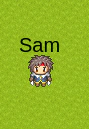
Display Name Above The Player
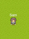
Components.text('{name}') creates a text component. The {name} placeholder
is resolved on the client from the synchronized player property.
Text Style
fill,
fontSize, fontFamily, fontStyle, fontWeight, stroke, opacity,
wordWrap and align.
Multiple Lines And Columns
Layout Options
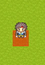
widthandheightdefine the layout box.marginBottommoves atoporbottomcomponent away from the sprite.marginRightmoves aleftcomponent away from the sprite.marginLeftmoves arightcomponent away from the sprite.marginTopcan be used for additional vertical adjustment.
top, left and right are placed outside the sprite graphic bounds, so they
do not cover a graphic that is larger than the hitbox. top is centered on the
graphic. bottom uses the hitbox as its positioning rectangle; a 32x32 shape
inside a 32x32 hitbox matches the hitbox when centered.
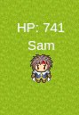
HP And SP Bars
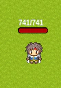
Components.hpBar() reads hp and param.maxHp and uses a red fill by
default. Components.spBar() reads sp and param.maxSp and uses a blue fill
by default. Pass fillColor to override the default color.
Bar Text
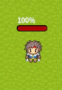
{$current}: current value{$max}: maximum value{$percent}: percentage without the%sign
null to hide it:
Other Positions
player.removeComponents(position) to remove all components at a position:
Custom Player Properties
Any synchronized player property can be used in placeholders.Custom CanvasEngine Components
Register a reusable CanvasEngine component on the client:Custom Event Renderers
Events can also be rendered by a client-side CanvasEngine component instead of the default graphic renderer. Register a resolver on the client:sprite
prop:
Graphic IDs And Legacy Tile IDs
player.setGraphic() accepts a spritesheet id, a legacy tile id, or an array
mixing both:
Components Or Animations
Use server-driven sprite components for persistent UI controlled by the server: name tags, HP bars, guild badges and status icons. UsecomponentAnimations and showComponentAnimation() for temporary effects:
hit numbers, explosions, spell effects and transitions that remove themselves
with onFinish.